Decals are trouble.
On SAAF subjects, despite whatever kit-makers lead you to believe on the box blurb, the decals are bound to be wrong. To be honest, South African enthusiasts can hardly agree on what is correct, so an Italian researcher is bound to miss. The biggest miss, as per usual, is the castle and bokkie. Will anyone ever get it right? I do hope so.
I measured the real castles (yes, with an unconventional method) and worked out the scale size I needed. I then searched high and low for an acceptable castle, and finally settled on the old (really old) 1:72 sheet from "S.A. Decals" in Isando, PRINTED IN GREAT BRITAIN it says on the yellowing sheet. 66 inch for the wing, and 54 inch for the fuselage - near exact in 1:32 scale. It is the best outline shape of the castle, and the bokkie I can find in this size, however I must mention that Leading Edge did beautiful ones on their SAAF Mk6 Sabre sheet. I just can't find any for sale in 1:32 scale. Darn! Notice the Tamiya 1:32 Spitfire decals to pinch the number "2" from for 80(2).

Enough ranting. Here is the next bit of trouble - gloss coating for a non-silvered decal finish. I am still using "Klear" (same as Future), which believe it or not, I hand brush on. I find it more controllable and less likely to orange peel than by airbrush. I am planning to stop this method however in favour of Tamiya X-22. Now to find Mr Color leveling thinner which apparently makes the X-22 like glass... good old fashioned Klear in this picture however:

A major concern of mine was the yellowed film on the castle decals, and you can see why.

So, carefully (more carefully than I did) cut out the outside of the white outline of the castle and voila! They are going to be lightly oversprayed so some little mistakes won't really show. The general look is good. See also the kit decal for the jettisonable canopy, which came off about as promptly as it went on. It must be the French version and way too big for our aircraft. The one in the IIIE/R looks much improved, but that is going on the R! If you have a very discerning eye (and many on this forum do), the answer is yes - I changed the order of the symbols on the hatch behind the canopy on purpose. They appear to have changed when painted in the blue/grey scheme. Look at how the electrical "lightning" symbol is raised - pretty thick kit decals.

Some compromises here. The squadron badge on this colour scheme doesn't have a black background, or the upper scroll, and it says SURSUM PRORSUSQUE on the lower scroll. I decided to use what I have however, and try disguise it with the overspraying and some masking fluid. Lets see. The "2" is a wee bit small, but also gets the treatment.

When attempting to place the ejection seat triangle on this side, I noticed the ladder holes as indicated in the kit are in the wrong place. Darn again! It makes quite a difference when they are in the right place, but is frustrating at this point in the build.

Based on the photo's of the ACM camp in Durban, you can see that the blue/grey C's don't have the old "Mirage IIICZ" written on the nose anymore. 802 however did. In the SA Flyer Magazine Vol.VI Issue VI "The best of SA Flyer's Glorious Flying History" there is another photograph of MADMAX, and one of 802 taken slightly earlier, in which one can clearly see the writing under some overspray.

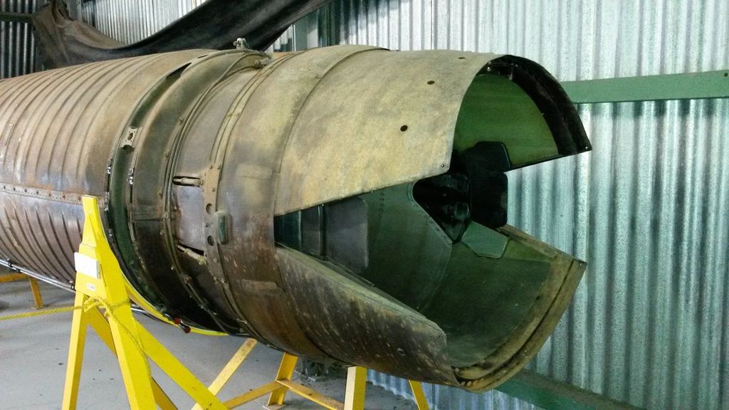
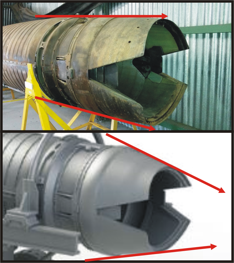
The left side done, including a blue band around the drag-chute cone. The primer sticking out of the elevon is because I can't stop trying to smooth out imperfections in the paint or varnish such as orange peel, brush hairs etc. It does get an overspray to rescue it in this case. The piece of paper in the background gives an indication of the experimentation with the shades of grey. Oh yes, check out the broken off tip of the vertical fin, again!